Affiliate Program with Click Bank

by : Blogging-secret.com

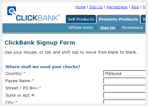
Last 2 weeks ago, when I want to sign up ClickBank affiliate program, I found that there is no any selection for country of Malaysia during the registration. After that, I have contacted ClickBank to clarify this matter, and I was told they didn’t allow Malaysia to participate their program at this moment.

clickbank affiliate program

Recently, I get to know ClickBank affiliate program now welcome Malaysian. If you are very keen to join ClickBank affiliate program, this is a good time for you to enter. Of course, with immediate action, I quickly clicked to ClickBank.com and signed up their affiliate program. After that, I have tried to search the ClickBank marketplace, I found that there are several profitable affiliate products that suit to promote on my blog and I will going to promote it later on.

If you are still new to ClickBank affiliate program, you can read the useful post titled Beginners Affiliate Marketing Guide with ClickBank which is posted by my dearest friend, Darly from Earn Money Blogging.

Increased Profits with Blogrolled.com

by : Blogging-secret.com

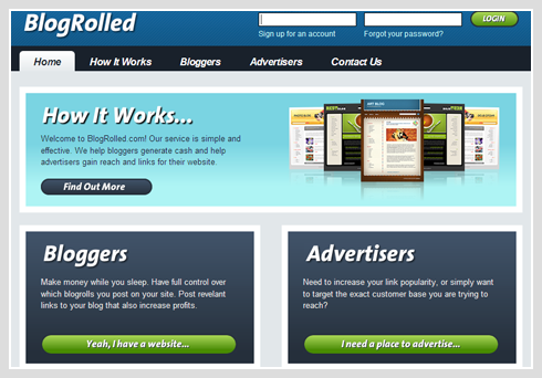
ReviewMe’s friend, Shawn Nafziger, has launched a service to help bloggers make even more money! It is called BlogRolled.com in which they provide natural search benefits by linking from blogs.

blogrolled

Bloggers, you have full control over which blogrolls you post on your site and post relevant links to your blog that also increase profits. You can have 10 active blogrolls per site. It is not necessary to insert code into your website/blog pages until you receive a Blogroll order from an Advertiser.

As for advertisers, if you need to increase your link popularity, you can simply want to target the exact customer that you can search from blogger’s listing. Pricing for Blogrolled.com

Publishers’ sites is based on a combination of link popularity, estimated readership (Alexa), and estimated RSS subscribers. Currently the price Blogging Secret is $40 for each blogroll link. But Bloggers will receive 50% of the sale price for each Blogroll link sold off of your website through their system.

Sadly to tell that BlogRolled.com does not have an affiliate program at this time, we are unable to make extra money from the referral link.

Why Blogger Don't Get It

In doing the research for my series of Adsense articles, two common ideas kept getting repeated:

  • My Adsense ads are horrible, they only pay out (insert low dollar figure here)
  • My Adsense CTR is horrible, I only get a (insert extremely low CTR here)

To be fair these comments weren’t coming just from bloggers, but bloggers did make up an overwhelmingly large percentage. I think this stems from a misconception on the part of the bloggers that they are entitled to high payout and CTR. I’d like to spend a little time to share my feelings on this subject. In the early days a blog may just have been an online diary or journal, but like the days of the Nehru jackets, they are gone. What a blog is now is Chronologically Structured Content Management System, as opposed to the classic web hierarchical structured implementation. Let’s be clear, you can still use a blog as your online diary or journal, but nowdays it’s just as likely to be used as a commercial blog. Yes, I did just say commercial blog, and no the earth didn’t open under my feet and swallow me whole for saying it. Let’s take some time to look at a your typical blog.

You may post about commercial related subjects like your job, what you like to buy, or even your hobbies. However these posts are all about your life, they are no more commercially viable or attractive than say Aunt Millie’s Holiday Newsletter. Yes we all have an Aunt Millie in our family, every year she sends out a finely crafted newsletter in a coordinating envelope she ordered from paperdirect.com telling us all about her family. We learn how hard her husband works, how many activities her kids are in and how good they are at them. We also read the details of how her scrapbooking business hasn’t taken off yet, but she promises to spend more time on it right after New Years. So if you were a business owner would you want to advertise anywhere on Aunt Millie’s Newsletter? Then why would a business want to pay you top dollar to advertise on your blog? What’s that, you say your blog gets (insert a high number here) of readers per day, surely that has to be worth something? Well did you know Aunt Millie sends out over 800 copies of her holiday newsletter to 17 countries, on 4 continents? Now before you get all fired up about it, understand that I don’t have a problem with you having a personal blog or sharing it with the public. However your expectation that it has value outside of your family/friends/community, is a serious misconception.

So what exactly is a commercially viable blog? Don’t think of it as publishing a blog, think of it as publishing an online magazine. You need to start out with good content or articles about a small area or niche topic. You will need lots of content, and unless you are well known, don’t expect much to happen until you’ve written at least 100 and more likely over 200 articles. Yes you will have to devote some time and effort to publicizing and marketing it as well. Once you’ve got a significant focused reader base, that’s the time to slowly ad in the advertising. Now here’s the one that causes lots of people to freak out. BE PREPARED TO GIVE UP SOME PRIME SCREEN REAL ESTATE, IN THE CENTER, ABOVE THE FOLD, TO ADVERTISING. If you’ve worked with print media at all you will know the middle of the right hand page is the most desirable spot inside of a magazine (excluding the cover pages). I’ve sat through meetings where people have said ” … you know we need more right hand pages …”. If you want people to click on your ads, you will need put them where they can see them, above the fold in the center of the screen, in a prominent location. Yes I can almost here the keys typing for the flame comments and emails now. Before you hit that send button though, ask yourself this, are you building a space sough after by advertisers, or are you working on Aunt Millie’s Newsletter? No I don’t think your pages should be filled with ads, in fact quite the opposite, there should always be more content than advertising, ALWAYS!

Next thing, lose the fancy graphics and eye-candy from your template. Yes I know you may have paid for a fancy template, maybe you had your niece who’s a graphic artist design something for you, or you really like the way that spinning flaming platypus looks in your page header. Here’s the thing, it’s detracting from your content. Graphics should be simple, understated, and support the content, not overpower or compete with it. Now before some art student wearing a beret, corduroy jacket with elbow patches, and smoking a pipe or French cigarette, writes and calls me a Philistine, stop and think. Are you designing a commercially attractive and viable space, or are you designing an intricate macrame border for Aunt Millie’s Newsletter? Remember keep it simple and to the point.

Yes I know you feel like I just ripped off the band-aid, and now it hurts. Sorry but someone had to do it. I know some of you are still out there reading saying ‘but can’t I still have this … do we have to get rid of this … I really like that …’. Well I’m not your second grade teacher who’s going to tell you everything’s all right, that you don’t have to change a thing, and put a scooby-doo sticker on your shirt to make you feel better. If you want a blog that makes you more money than you spend at Starbucks every Tuesday, you will need to get serious about what you’re doing.

If none of this sounds incredibly fun, and really sounds pretty close to actual work, here’s the way I see it, getting an Adsense check for $5 is fun, getting an Adsense check for $500 or $5000 is work.

Disclaimers:
I don’t actually have an Aunt Millie, she’s a fictional character. But like you, I do have relatives who send out holiday newsletters.

Yes I know the minimum Adsense payment is $100, so you never could get a $5 check, but I was just making a point, mmkay?

You can get more if you visit this!!
Adsense Optimization

Google recently held a webinar for AdSense publishers. They gave out some adsense optimization tips that they have gathered over the past few years. The transcript is pretty lengthy, so here's the summary:

  • Ad Location - "the middle, above the fold location perform best." Also "if you have an article page with a long body of text, the bottom of that article is actually pretty successful" and you must be place adsense in maximal adsense to location blog..
  • Ad Formats - "the top three formats are the 336x280 that you see on the page; the 300x250 medium rectangle; and then the 160x600 wide skyscraper." Additionally "the wider ad formats are doing better than the other ones and the reason is that they actually take up fewer lines. And so with every additional line, you have a chance of losing that interested user."
  • Ad Colors - Pick colors that blend well with the site. Matches the background color, and compliments the site. Make them feel like a part of the site. They give an example where a customer went from blended background to yellow, and clicks dropped 65%. Choose color must be matches the background your blog..
  • Ad Blindness - if the colors stick out too much, readers may immediatly identify them as ads and not even look at them. Also frequent readers may stop reading ads so you could alternate positioning and colors to get their attention. "The more you blend in with the site, the less chance that ad blindness will occur."
  • Experiment - this was a big theme in the webinar echoed by all experts. Use channels to test different colors, positioning, and formats to find out what works best. They show that you can more than double your revenue just by finding the right color, position, format combo.
  • Image Ads - If you want to maximize revenue they recommend turning them on. I personally disable them in my account, because I find them too distracting/annoying to the user. Yes you may increase your CPC, but you will probably decrease impressions over time.
  • Link Units - Don't take up much space, and also "allows the user to refine what they're interested in. So if they may not be interested in specific ads on your page, they might be interested in a particular topic, and by clicking on a link unit and a link in the link unit, they'll be able to specify that they're interested in that specific topic and get a lot more options and variety on the ads that might appear." I also bet google remembers what they click on and then tries to generate better ads for the page... just my speculation.
  • AdSense For Search - You can use this for your site search, and you get a percentage of ad clicks. Place this in top Right in your blog/web
  • Focus on Content - Duh!
  • Don't click on your own ads - One of the callers asked the question "I was just noticing that someone asked about clicking on their own ads and it says you're not supposed to. And I don't remember reading that. And I occasionally do click on the ads... So is that detrimental in some way?" - I can't believe they said that to google. Google's response was: "Yes, that's sort of chief among the terms and conditions".
  • Impression Counter - Google confirmed that Page Impressions are counted when a public service ad (or alternate ad url or color) is displayed.
  • Your site is unique - all these things may not matter, the best location, format, and color is different for every site. So again, go experiment.
You can try this to you blog or your website.. and ihope you can success.. for this

New Readmore....

Read More... or Baca Selanjutnya... (for Indonesian vesion)
yeah, the word is nice for you want has to your blog... , but this readmore for only New Template.. and not for classic Template, so don't missed

and you can try for your blog if you following this :

  • Sign in to your blogger
  • choose Layout.
  • And choose Edit HTML.
  • Click a litle box beside word Expand Template Widget.
  • and Copy this code on the </head>
    • <script type='text/javascript' src='http://amen24.googlepages.com/Readmore.js' />

  • Create the blue code for your template blog.
    • <h3 class='post-title'>
      <b:if cond='data:post.url'>
      <a expr:href='data:post.url'><data:post.title/></a&>
      <b:else/>
      <data:post.title/>
      </b:if>
      </h3>
      </b:if>
      <div class='post-header-line-1'/>
      <div class='post-body' expr:id='"post-" + data:post.id'>
      <b:if cond='data:blog.pageType == "item"'>
      <p><data:post.body/></p>
      <b:else/>
      <style>#fullpost {display:none;}</style>
      <p><data:post.body/></p>
      <span id='showlink'>
      <p><a expr:onclick='"javascript:showFull(\"post-" + data:post.id + "\");"' href='javascript:void(0);'>[+/-] CONTINUE...</a&></p&>
      </span>
      <span id='hidelink' style='display:none'>
      <p><a expr:onclick='"javascript:hideFull(\"post-" + data:post.id + "\");"' href='javascript:void(0);'>[+/-] Sample...</a></p>
      </span>
      <script type='text/javascript'>checkFull("post-" + "<data:post.id/>")</script>
      </b:if>
      <div style='clear: both;'/> <!-- clear for photos floats -->
      </div>
      </div>
  • And Click Save Template.

And you must following this section :
  • Clicks Setting
  • Choose Formatting Menus
  • Copy this code in the box Template Post.

    • <span id="fullpost">

      </span>

  • Click Save Setting and.......
  • Finish....
You can try For you blog Okey...
Happynice Days

And i have note for you, if you create your post you must create in Edit Html (corner box)
  • For description you must create on <span id="fullpost">
  • and other post/text you must create on </span>

Adding Your Blog to Search Engine

You want your blog to read other people.. if you want you must be log in to search engine, many search engine you can choose one or two and free..


---->> You can log in to google search engine you must following this :

  • You can sign in www.google.com/addurl
  • Submit your URL web/blog to coulomn that
  • Write comment with your key word
  • if finish you can click ADD URL
  • and Finish.

Wait to 2 or 4 week for indexing to google.. if finish you can try.. write your url to Search Engine and you can see your blog.

---->> You can log in Yahoo search engine .. :
  • You can going to https://siteexplorer.search.yahoo.com/submit
  • Before to yahoo you must be have yahoo email.. if you have you can log in to yahoo... with your email address.
  • Submit your URL web/blog
  • If you submit your Feed you can write your feed to box feed
    • Example : www.elcomsite.blogspot.com/feeds/posts/default?alt=rss or www.elcomsite.blogspot.com/atom.xml
  • Finish.

---->>With MSN :
Its easy you know that.. you can try to your site and you can have high traffic.


Submit Your Site To 40 Top Search Engines for Free!

Submit Your Site To The Web's Top 50 Search Engines for Free!

Change Your Address Bar Icon

If you open your blog.. you can look at this icon in you address blog... and may be you want change this icon with your favorites icon...

  • Open Browser link www.iconarchive.com
  • Choose your favorites icon..
  • Copy link location at Download icon
  • Sign in your blog choose layout and click edit HTML.
  • Copy this code <link href='http://elcomsite.blogspot.com' rel='SHORTCUT ICON'/>
  • Take the link location icon to SHORTCUT ICON.
  • Copy code to tag <head> .......... </head>
  • Finish.
Example :
<head> <link href='http://elcomsite.blogspot.com' rel='<img src="http://us.i1.yimg.com/us.yimg.com/i/mesg/emoticons7/20.gif'/><
/head>


You can try to your address bar..

Make Emotions Icon in Your Post

if you chatting in yahoo massanger you can have this emotions icon happy and other..
you can have this icon to your post blog..
if you write your post, you must in icon.. choose edit HTML and dont at Compose

<img src="http://us.i1.yimg.com/us.yimg.com/i/mesg/emoticons7/1.gif"
width="18" height="18" border="0"> for


<img src="http://us.i1.yimg.com/us.yimg.com/i/mesg/emoticons7/2.gif" width="18" height="18" border="0"> for

<img src="http://us.i1.yimg.com/us.yimg.com/i/mesg/emoticons7/3.gif" width="18" height="18" border="0"> for


<img src="http://us.i1.yimg.com/us.yimg.com/i/mesg/emoticons7/4.gif" width="18" height="18" border="0"> for


<img src="http://us.i1.yimg.com/us.yimg.com/i/mesg/emoticons7/5.gif" width="18" height="18" border="0"> for


<img src="http://us.i1.yimg.com/us.yimg.com/i/mesg/emoticons7/7.gif" width="18" height="18" border="0"> for

<img src="http://us.i1.yimg.com/us.yimg.com/i/mesg/emoticons7/8.gif" width="18" height="18" border="0"> for

<img src="http://us.i1.yimg.com/us.yimg.com/i/mesg/emoticons7/9.gif" width="18" height="18" border="0"> for

<img src="http://us.i1.yimg.com/us.yimg.com/i/mesg/emoticons7/10.gif" width="18" height="18" border="0"> for

<img src="http://us.i1.yimg.com/us.yimg.com/i/mesg/emoticons7/11.gif" width="18" height="18" border="0"> for

<img src="http://us.i1.yimg.com/us.yimg.com/i/mesg/emoticons7/13.gif" width="18" height="18" border="0"> for

<img src="http://us.i1.yimg.com/us.yimg.com/i/mesg/emoticons7/14.gif" width="18" height="18" border="0"> for

<img src="http://us.i1.yimg.com/us.yimg.com/i/mesg/emoticons7/17.gif" width="18" height="18" border="0"> for


<img src="http://us.i1.yimg.com/us.yimg.com/i/mesg/emoticons7/20.gif" width="22" height="18" border="0"> for

<img src="http://us.i1.yimg.com/us.yimg.com/i/mesg/emoticons7/21.gif" width="18" height="18" border="0"> for

you try this icon for your blog...

Code HTML in your Posting

Before Create your posting you must create your posting in NotePad after create your posting in NotePad clicks Replace take from Edit :
In this code to coulomn


< - &lt;

&gt - &gt;

&amp - &

&" - "

for plus minus - ±

space - Space

&copy - ©

&reg - ®


example :

you want in this code to your blog..

<meta http-equiv="refresh" content="10">

</meta>

you Write to NotePad and try to your blog okay..


Create Read More... for Classic Template

Sign in blogger.com and click layout.. Click edit HTML
Next...

  • Copy This code on the </style>
  • <MainOrArchivePage>

    div.fullpost {display:none;}

    </MainOrArchivePage>

    <ItemPage>

    div.fullpost {display:inline;}

    </ItemPage>
  • Copy and paste this code after <$BlogItemBody$> <MainOrArchivePage><br/>

    <a href="<$BlogItemPermalinkURL$>">Read more!</a>

    </MainOrArchivePage>
  • Clicks Setting choose Formatting copy and paste this code in box Post Template <div class="fullpost">


    </div>
  • Click Save Settings.
  • Finish

You can try in your blog.. ist easy you know that..!!!


Create DTree Menu to your Blog

DTree is a menu that be arranged like a tree. It will be like menu when you open "windows Explorer". It's very usefull if you have many posting (articel) in your blog. It can contain many link in small space. It will be like the below image :


Here's the step by step tutorial to create "DTree Menu" in blogger:

1. Login to Blogger, go to "Layout --> Edit HTML"
2. Put the code below over <head>

<link rel="StyleSheet" href="http://kendhin.890m.com/dtree/dtree.css" type="text/css" />
<script type="text/javascript" src="http://kendhin.890m.com/dtree/dtree.js"></script>

3. Save your editting.

4. Now edit end copy the below code then put on your sidebar.

<div class="dtree">
<script type="text/javascript">
<!--
d = new dTree('d');
d.add(0,-1,'My example tree');
d.add(1,0,'Node 1','link.html');
d.add(2,1,'Node 1.1','link.html');
d.add(3,2,'Node 1.1.1','link.html');
d.add(4,3,'Node 1.1.1.1','link.html');
d.add(5,0,'Node 2','link.html');
d.add(6,5,'Node 2.1','link.html');
d.add(7,5,'Node 2.2','link.html');
d.add(8,0,'Node 3','link.html');
d.add(9,0,'Node 5','link.html');
document.write(d);
//-->
</script>
</div>

Change "link.html" with your own link.
The first number must be unique (d.add(1,0,'Node 1','link.html');
The second number is child of the number (look at the color).

You can add the below code to add a new node with your own image

d.add(10,0,'Profile','link.html','','','http://kendhin.890m.com/dtree/trash.gif');

change "http://kendhin.890m.com/dtree/trash.gif" with your own image.
it will be like this :

How to Create Search Engine in your Blogger

Now I will show how to create "Search Engine" in your blogger. This Search Engine is use to find articel in your blog, not to find articel at all website in the world. It's very easy, just follow the trick below you will have search engine in your blog. Here's the step:

1. Login to Blogger, Go to "Layout --> Page Elements". Klick "Add a page elements" then chose "HTML/Java Script".
2. Put the code below into "Content" Box

<form action="http://yourblogname.blogspot.com/search" method="get"> <input class="textinput" name="q" size="30" type="text"/> <input value="search" class="buttonsubmit" name="submit" type="submit"/></form>

Change yourblogname with your blog's name. The number "30" is width of your search engine, you can change it for appropriate to your layout.

How to Create Blogroll

As a bloger, we usually added our Friends link on our blog. Day by day and month by month it's number will increased. But if your friends link over than hundredsor or even thousands, it will be a problem, your blog space will full of your friends link list.
Now I will show you how to create a blogroll, a box to place your friends link list. You can fill it with as many as links, and it's size will not get bigger. So it will save space on your blog or sidebar. The box will be like mine.

Here's the code that you should to copy and place on your blog or sidebar ("Add Page Element --> HTML/Java Script").


<div style="border: 1px solid rgb(153, 153, 153);
overflow: auto;
width: 200px;
height: 300px;
text-align: center; ">

#link1 <br />
#link2 <br />
#link3 <br />
#link...

</div>

Note:
- Text width: 200px; and height: 300px; is size of the box, you can change it according to your place or sidebar size .
- Change the text "#link1,#link2, #link3 dst" with your friends link list.

How to Promote Your Artwork Online

The Good Stuff! - Tricks of the trade.

E-mail. Create a signature file with your URL and a short description of your site. Some people create little pieces of ASCII art to go with it. This is your internet business card.

Newsgroups. Find topics relating to your works or interests via a search at Deja News - http://www.dejanews.com. Then, go to these Newsgroups and read some of the conversations that are going on. If you feel you could contribute to a conversation, introduce yourself. Your signature file at the end of your e-mail posting will be enough to get traffic to your site without seeming like you're pushy. It's rude to simply butt into a newsgroup and say "Look at my site!". It's like interrupting a conversation. The one place where you're allowed to say "I have artwork for sale" is at alt.art.marketplace.

DON'T SPAM! Newsgroups or e-mail - ever! It's not worth it. Your reputation will be ruined and you can't afford that. You will receive hate mail and e-mail bombs that could erase your hard drive and cause everyone on your server to lose their e-mails! Ultimately, the servers would have to add more connections to deal with all the spam and pass the cost on to all of us. Here is a better way: Newsletters.

Start your own free newsletter by having a SIMPLE sign up form on your site. Explain what they'll get if they sign up. I say they get to see my latest works, discounts on my stuff, and announcements of upcoming works. Mention your newsletter in appropriate newsgroups. Encourage people to join if they want to know what's new. I have about 1000 people who are part of my newsletter. It took about 9 months of promotion to do it. However, now I have a VOLUNTEER CAPTIVE AUDIENCE in which I can "spam" to. These people WANT to know what I have to say cause they asked me for it, therefore they are not offended with my art promotions and sales.

Get a referral program started. I got a great free one from BigNoseBird.com. This simple cgi program allows a visitor to recommend your site or page to several friends via e-mail. Nothing brings in traffic than a good referral.

Start a contest. People LOVE free stuff! Raffle a print or a service. Set up a simple form and post the rules and the deadline. Add if they want to join your free newsletter while they're at it. Offer everyone who wasn't the winner a discount on something in your gallery. That way, everyone's a winner. Add your contest to http://www.onlinesweeps.com. Watch your traffic skyrocket!

Check out Virtual Promote! I found lots of great tip, tools and tutorials there on web site promotion.

Down the road. - When you have some cash.

Get credit card capabilities and accept them on-line. I got mine from Total Merchant Services. They were good because their bank readily accepts on-line business as legitimate, whereas most traditional banks do not - yet. I'm not totally thrilled with the software they provided, but after a lot of searching around, I found that they're pretty good compared to what's out there. You'll pay at least $35.00 a month for the credit card service plus you can lease the software for $40.00 a month or opt to buy it outright for about $1000.00. I know you're going "Ouch!" right now, but nothing beats immediate gratification if you're an impatient surfer. Otherwise, they'll have to pay by check or money order. Which means, print out the order form, fill it out, get off line, write the check and mail the order. Too many steps there in which one can become lazy and forget all about it. With on-line credit card capabilities, you fill out a form and press a button and that's it. Not only that, but paintings can be expensive. People tend to charge things over $500.00 or more.

Place some paid advertisements in traditional magazines and newspapers. Choose a magazine that is into your genre. I place ads in fantasy and wildlife magazines because that's what I paint. Cost for advertisements can range from a $12.00 classified to thousands of dollars for a one or two page ad.

Find a web site that is related to your artwork and gets LOTS of traffic. Ask them if they would accept your banner on their main page if you paid them a monthly fee. I got one site to do this for me by just giving them a print! I get tons of traffic this way.

Use a great on-line promotion company called The Internet Marketing Center. I recommend the site highly! Lots of great tips and tricks!

PROTECT YOUR IMAGES FROM COPYRIGHT VIOLATORS!

Go to http://www.gamacles.com and buy their Image Protect software. This is the secret to my java applet images of my work that you can't right click on to save them. You also can't link to them and steal my bandwidth! A GREAT ARTISTIC ASSET!

Buy attractive and professional business cards and brochures with your web site address printed on them.

My last piece of advice is stick with your promotions for a long time. Don't just give up if one thing doesn't work. Change your strategy and try again. Surfers see web pages come and go and they don't take someone seriously unless you've been around for a long time. Stick with it, even through periods of no sales and low traffic. You must decide now to be in it for the long haul or you will fail. There is no overnight success and don't let anyone tell you otherwise. You'll have to work hard and be thick skinned.

How to Promote Your Artwork Online

Article written by Rebecca Gallant of Becky's Wildlife and Fantasy Art.

Well, if you were anything like me, you'd have just tons of great artwork you wanted to show the world, but you hadn't a clue as to how you were gonna get the world to look at it, much less buy it.

Well, I was determined to find out how this crazy Net thing worked. I learned all on my own with minimal investment on how to be seen from California, USA to Tokyo, Japan. Here's your opportunity to pick my brain and learn all of my secrets!

This is not for the web newbie. This is if you already have a web site going and you the need traffic!

Let's Get Started!

Web Page Basics - A list of do's and don'ts.

DO make sure your site is compatible with most of the browsers out there today. Make sure Netscape and Internet Explorer users, down to at least 3.0, can see your stuff.

DO organize your site into separate categories. Have a list of navigation links on EVERY page. DO NOT cram all your paintings onto one loooong page. People will not wait for it to download. Separate your images into appropriate categories. Place all your awards on one page, your links and banners on another, your bio on another, your web rings on another, etc.

DO tell your visitors who you are, what you are about, what your page is about and what you want. Be clear, concise and to the point. Spell check everything. Have friends and family test it out and look it over for broken images or misspellings. Ask them if they felt anything was confusing to them. Just because you know what you mean, doesn't mean everyone else does. Finally, run your pages through the great free services at Web Site Garage!

continue...

5 Easy Ways to Improve Your Website's Legibility

By Debbie Campbell

Websites that make their customers work to read them are not the best way to get business. Miniscule fonts, text in colors that make it hard to see against the background color, and lines that are piled on top of each other are problems, but they're easy to correct. Let's jump right in and look at five easy fixes:

1. Format your text using CSS.

Cascading Style Sheets (CSS) are the way to go - use one style sheet and control how text looks on your entire site. Make a change to the style sheet and your whole site is updated. It makes life a lot simpler.

2. Make the font size big enough to read.

Consider your target audience. Even if they are a group of teenage girls looking for new shoes, it's never a good idea to use tiny type. It doesn't have to be enormous, but up to a point, larger type is better. 12-pt Verdana is better than 8-pt Verdana.

3. Make the text contrast with its background.

The more contrast, the better. Black-on-white or white-on-black are examples of the highest contrast you can get. Use colors if you like, but if you squint at the page and your text basically vanishes, there's not enough contrast.

4. Give the lines room to breathe.

Don't stack lines on top of each other. Use the line-spacing directive in CSS and give it some space; I'll often set line-spacing to 140% of the height of a typical line.

5. Break text up into chunks.

No matter how good a writer you are, people don't want to read endless pages of text. Break it up by using headlines that reflect the subject of the paragraph(s) to follow so people can scan down to the parts that really interest them, or use bulleted lists to change the pace of the writing and slow down the scanning.

And finally (not one of the 5 Easy Ways to Improve Legibility but still quite important) check your spelling. Nothing irritates me more on a web page than spelling errors - it simply makes you look like you don't care enough to get it right. Use that ubiquitous spellcheck tool.

Making your website's content more legible is easy. It doesn't take a lot of time, mainly common sense. The payoff will be text that's more readable, customers that stick around long enough to get your message, and improved credibility with your visitors.

Copyright 2006, Debbie Campbell

Your Choice of Web Site Color

by Scott Pamatat of DesignMore.com

A discussion forum at the Internet marketing challenge web site (http://www.marketingchallenge.com?13417) sparked the idea for this article. It is a great place to discuss ideas and receive informative suggestions and because of that I visit the forum often.

Many web designers overlook the importance of color when designing a web site. Color should be one of your first concerns when it comes time to start your web site design. If you don't pay close attention to the colors you chose, your site you will end up either plain and boring or so chaotic it's hard to look at. The color you use should only be chosen after careful consideration.

Unfortunately web browsers can only see 256 colors. Even that number is hindered because all browsers don't share the same 256-color pallet. Currently web browsers only share 216 common colors. When designing key elements in your web site you should stay within the 216-color pallet.

If you go outside the 216 color pallet you start to use colors that do not exist within that browser. The browser has to mix the colors that do not exist. In order for the browser to display the color, it needs to take tiny dots from the colors native to that browser to come up with an approximate color. This is known as dithering. Some displays will distort the tiny dots to the point where the image is so speckled that it does not appear to be a solid color. This makes text very hard to read if it is placed over the dithered color. You should always use a browser safe color when using solid color as a design element. Some of the browser safe colors should be used with caution though.

Most of the eye operations are muscular and just like all other muscles it tires out. I will illustrate with an example. (This is a test I learned about 7 years ago and is very effective to get the point across). This is a simple test that should take only 45 seconds. If you do this short test, you will be better able to understand what I'm about to say. Go to this page and then come back. http://www.designmore.com/ctesta.htm

What did you see when you looked at the white box? Did you see a bluish green color? (If not go back and do the test over). No this is not a trick or hallucination. There is a simple explanation. Without getting too technical, I'll tell you what just happened.

In the back of your eye there is a thin layer of tissue that contains millions of tiny light-sensing nerve cells called rods and cones. Cones respond to specific wavelengths of light. Your eye is filled with color decoding cones. When you looked at the red box the cones that detect the red wavelength become tired and fatigued. When this happens the opposite cones in your eye start to kick in. Hence the bluish green color you saw. Now that you know there is a scientific reason behind eye fatigue you should apply it to your web site.

I'm sure you have you noticed that caution signs are usually yellow. Pure yellow strains your eye more than any other color because of that, it is the first color your eye will fix on. Using these colors (I still advise you to use it sparingly) for banners and advertisements will receive more attention from the viewer's eye. Once the visitor comes to your site there is really no reason you should irritate the visitor with bright colors. You have done a good job if they are viewing your site.

You should use yellow and red colors sparingly in your web site itself. Only use them in areas where you want the visitor to focus on. Do not make large parts of your web site with bright color. It might get your visitors attention but they will either consciously or subconsciously notice their eyes getting fatigued. This will make them not want to look at your web site for long periods of time. There are enough reasons why a visitor would leave your web site. You don't need to add to that list by using irritating color.


EleC_Com